What Your 404 Page Says About Your Brand

Post pobrano z: What Your 404 Page Says About Your Brand
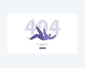
A 404 page is a moment of failure. The user has clicked a link or typed a URL and arrived at a dead end. The content they were expecting is not there. This is not a rare edge case; it is a routine part of the web experience. How you handle this failure communicates something about your brand. It is an opportunity to build trust or to erode it.

The Standard 404: A Missed Opportunity

The most common 404 page is a generic, system-generated error message. “404 Not Found.” A stark, technical phrase that offers no guidance, no comfort, and no reason to stay. This page is the digital equivalent of a locked door with no note and no apology.

This is a failure of empathy. A user who arrives at a 404 page is already frustrated. They have been redirected, disappointed, or confused. A generic error message compounds this frustration. It offers no explanation. It offers no path forward. It tells the user that the system has failed and that the system does not care.

The Empathetic 404

An effective 404 page turns a failure into an opportunity. It acknowledges the problem, explains it in plain language, and offers a clear path forward.

The language should be human. “Oops, we couldn’t find that page.” Not “404 Not Found.” The explanation should be simple. “It looks like the link you followed might be broken, or the page might have been moved.”

The design should be consistent with the brand. A playful brand can use humor. A serious brand should be serious. A minimalist brand should be minimal. The 404 page is not an exception to the brand guidelines. It is an extension of them.

The Functional 404

The most effective 404 pages offer a clear path forward. The best thing you can do is provide a search bar so they can find what they were looking for. A sitemap or a set of popular links can also help users find their way.

The functional 404 page is not just a landing. It is a navigation tool. It helps the user recover from the dead end and continue their journey. A simple search bar, a link to the homepage, and a few popular pages are usually enough.

The Branded 404

Some brands use the 404 page as an opportunity for creative expression. A clever illustration, a witty message, or a playful animation can turn a moment of frustration into a moment of delight.

The tone of the 404 page should be consistent with the brand’s personality. Mailchimp uses a playful illustration. Dropbox uses a simple, friendly message. The design should feel like a natural part of the brand’s visual language.

The risk is that a humorous 404 page will feel dismissive. If the user is genuinely frustrated, a joke can feel like mockery. The humor should be gentle, not condescending.

The SEO Impact

A well-designed 404 page can also have a positive impact on SEO. By providing clear navigation and helping users find relevant content, you reduce bounce rates and signal to search engines that your site is well-maintained. Conversely, a poor 404 page can harm your search rankings by creating a poor user experience.

The Bottom Line

A 404 page is a moment of failure. It is also a moment of opportunity. The user is lost. They are frustrated. They are looking for a way forward. What they find is a reflection of your brand. A generic error message says you do not care. A helpful, empathetic, branded page says you do.

Design your 404 page as carefully as you design your homepage. It is not an edge case. It is an essential part of the user experience. The user who lands on your 404 page is the user who needs your help the most. Give it to them.

The post What Your 404 Page Says About Your Brand appeared first on Designer Daily: graphic and web design blog.
The Scroll Map That Told the Truth

Post pobrano z: The Scroll Map That Told the Truth

Heatmaps and scroll maps are the diagnostic tools of the digital age. They tell us where users look, where they click, and how far they scroll. The data is objective. It does not lie. But it does not always tell the truth, either. The truth is often more complicated.

The Scroll Map That Changed Everything

A client came to us with a problem. Their homepage had a 70% bounce rate. They had invested in a beautiful design, with a compelling hero image, a clear value proposition, and a prominent call-to-action. But users were leaving in droves.

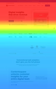
We ran a scroll map. The data was damning. Only 15% of users scrolled past the hero section. The 85% who never scrolled were seeing only the top third of the page. The beautiful content below was invisible. The call-to-action, which was placed in the third section, was never seen by the majority of users.

The scroll map told the truth: the design was failing. The content was there. The users were not.

The Data Behind the Truth

The scroll map revealed a pattern that the client had missed. The hero section was visually impressive, but it was also overwhelming. The image was large, the headline was long, and the subheadline was dense. The user was not compelled to scroll. They were compelled to leave.

The scroll map also revealed something else. The 15% who did scroll were not scrolling to the call-to-action. They were scrolling to the testimonials. They were looking for social proof before they were willing to take action. The call-to-action was in the wrong place.

The scroll map did not just tell the client that the design was failing. It told them why. It revealed the disconnect between what the designer intended and what the user wanted. The data was objective. The interpretation was the truth.

The Redesign

The client redesigned the page based on the scroll map. They shortened the hero section. They simplified the headline. They moved the testimonials above the call-to-action. They made the primary call-to-action visible earlier in the page.

The results were dramatic. The scroll depth improved. The bounce rate dropped. The conversion rate increased. The scroll map had told the truth. The client had listened.

The Limits of the Scroll Map

Scroll maps are powerful. But they are not omniscient. They tell you where users scroll. They do not tell you why. They tell you what users do. They do not tell you what users want.

The scroll map is a starting point. It is a diagnostic tool. It is not a solution. The solution comes from understanding the user. The scroll map is a clue. The truth is in the interpretation. It is in the synthesis of data, observation, and empathy. The scroll map told the truth. But the designer had to listen.

The Bottom Line

The scroll map is a tool. It is not a substitute for judgment. It is a way of seeing. It tells you what is happening on the page. It does not tell you what is happening in the user’s mind. The data is objective. The truth is subjective.

The scroll map that told the truth was the scroll map that was interpreted with empathy. It was the scroll map that was used to understand, not just to measure. The data was the beginning. The redesign was the end. The truth was in the middle.

The post The Scroll Map That Told the Truth appeared first on Designer Daily: graphic and web design blog.

The Mascot That Became a Liability

Post pobrano z: The Mascot That Became a Liability

For a brand, a mascot is one of the most powerful visual assets it can own (but not always). It is a symbol of identity, a shortcut to recognition, and often a vessel for customer affection. When handled correctly, it becomes inseparable from the brand itself. When handled poorly, a mascot can transform from an asset into a very expensive liability .

The question is not whether a mascot can become a problem, but how. Mascots become liabilities when their meaning becomes contested, or when the actions taken to protect them generate more resentment than the protection is worth.

Cultural Misalignment: When “Pride” Becomes “Offense”

The most intractable liability occurs when a mascot’s meaning is fundamentally contested by a significant group of people. The long-running controversy over Native American mascots in American sports is a powerful example. Supporters often frame the mascot as a “point of pride, something to rally around” . To them, it is a symbol of honor.

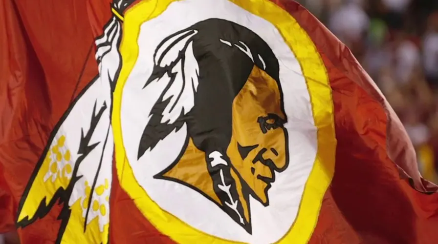
However, to many Native Americans and their allies, the same images are seen as degrading racial stereotypes. The “Redskins” mascot, for instance, has been described by opponents as a “dictionary-defined racial slur designed from the beginning to promote hatred and bigotry” . This is not a minor disagreement about aesthetics; it is a fundamental dispute about identity and respect. This type of conflict can persist for decades, draining brand goodwill, alienating customers, and leading to legal and political pressure . In these cases, the mascot doesn’t just fail to be a unifying force; it becomes a symbol of division and controversy.

Aggressive Enforcement: The Legal Landmine

A mascot can also become a liability through the actions taken to defend it. Buc-ee’s, the Texas-based convenience store chain famous for its buck-toothed beaver mascot, provides a textbook case of this in 2026.

Buc-ee’s has a history of aggressively enforcing its trademark against other businesses using cartoon animal logos, including a moose, an alligator, and a bear . The strategy is simple: clear the field around a valuable mascot to prevent any “confusion” .

The trouble began when Buc-ee’s filed a federal trademark lawsuit against Beaver’s Mini Mart in Beavercreek, Ohio. The chain argued the small shop’s smiling beaver logo was too similar to its own brand . However, the two logos look quite different: Buc-ee’s beaver has buck teeth and wears a red cap, while Beaver’s beaver is a full-body, unclothed mascot .

The legal argument is one thing; the public perception is another. The backlash was immediate and severe, becoming a “full blown public relations headache” . A GoFundMe campaign for the mini mart’s legal fees raised tens of thousands of dollars . A local bakery sold cookies with the mini mart’s logo on them . A city council passed a resolution recognizing the beaver as part of the city’s history .

The outrage was framed by a stark sense of injustice. A massive national corporation, just one of its new Ohio locations boasting 74,000 square feet and 100 gas pumps, was seen as picking on a local family-run carryout . The local shop’s defense, a blunt “A moose is not a beaver” against a previous lawsuit, captured the sentiment . This was not seen as legitimate brand protection; it was perceived as bullying.

What Happens When Mascots “Die”

A different kind of liability can emerge from a deliberate attempt to create buzz. When Planters killed off Mr. Peanut in 2020 and Duolingo did the same with Duo the Owl in 2025, the stunts generated massive engagement . However, it is a high-risk strategy. It requires a brand personality and audience that can handle such edgy content .

For many mascots, there simply isn’t the deep emotional attachment to make the “death” feel like a significant cultural event. When the attachment is shallow, the stunt just feels like a cheap grab for attention, risking brand dilution rather than generating a conversation. As one expert noted, the “legend” of Duo the Owl only works because it’s already part of a bigger pop culture conversation .

The True Liability: The “Why”

Ultimately, a mascot becomes a liability when the meaning it holds for your audience clashes with the meaning it holds for you. The central conflict in the Buc-ee’s case is exactly this clash of meaning. Buc-ee’s views the lawsuit as standard brand protection, a legal necessity to defend its “valuable” logo . The people of Beavercreek see a national corporation attacking a “neighborhood business whose name and mascot reflect the community where it operates” . To the community, the beaver symbol is connected to local relationships and a proud history .

The legal case will be decided by a judge or jury on legal merits. But the court of public opinion has already ruled, and it found the mascot’s enforcement to be a liability. This mismatch, treating a symbol of local identity as a corporate asset to be legally defended, is what turns a mascot from a friend into a foe.

The post The Mascot That Became a Liability appeared first on Designer Daily: graphic and web design blog.

What Jazz Improvisation Teaches About Design

Post pobrano z: What Jazz Improvisation Teaches About Design

At first glance, jazz and design seem to have little in common. One is a musical form defined by spontaneous creativity. The other is a disciplined practice of problem-solving and visual communication. But look closer, and the parallels are striking. Jazz improvisation is a masterclass in working within constraints, responding to context, and trusting your instincts. It is a model for creative practice.

The Structure Beneath the Spontaneity

Jazz improvisation is not freeform chaos. It is built on a framework of chord progressions, scales, and rhythmic patterns. The musician knows the structure, understands the rules, and uses that knowledge to create something new.

The same is true for design. A successful design is not a random collection of visual elements. It is built on a framework of principles, constraints, and goals. The designer knows the structure, understands the rules, and uses that knowledge to create something new. The improvisation is not a rejection of structure. It is a dialogue with it.

The Art of Listening

Jazz is a conversation. The musician listens to the other players, responds to their cues, and builds on their ideas. The music is not created in isolation. It is created in dialogue.

The same is true for design. A designer who does not listen to the client, the user, or the context is a designer who is working in isolation. The best design is the result of a dialogue: between the designer and the brief, between the form and the function, between the vision and the constraints.

The improvisation is not a monologue. It is a response.

The Courage to Make Mistakes

Jazz improvisation involves risk. The musician plays a note that is outside the expected scale, a phrase that does not resolve cleanly. The risk is that the note will sound wrong. The reward is that the note will sound new.

The same is true for design. A designer who plays it safe, who follows the expected path, will produce work that is competent but predictable. A designer who takes risks, who tries something unexpected, will produce work that is surprising and memorable. The risk is that the design will fail. The reward is that it will succeed in a way that no one expected.

The Role of Repetition

Jazz improvisation is not always about novelty. The musician returns to familiar phrases, repeats a rhythmic pattern, builds on a theme. The repetition is not a lack of creativity. It is a way of creating structure, of giving the listener something to hold onto.

The same is true for design. A designer who reinvents the wheel for every project is a designer who is wasting time. A designer who builds on existing solutions, who adapts and refines, is a designer who is working efficiently. The repetition is not a lack of creativity. It is a way of building consistency.

The Bottom Line

Jazz improvisation teaches us that creativity is not about breaking the rules. It is about understanding them well enough to play with them. It teaches us to listen, to respond, and to take risks. It teaches us that the structure is not a limitation. It is a foundation.

The next time you sit down to design something, think about the jazz musician. Think about the structure. Think about the dialogue. Think about the risk. The improvisation is not a rejection of the rules. It is a conversation with them. The improvisation is not a moment of chaos. It is a moment of clarity. The improvisation is not a departure from the craft. It is the craft, at its most alive.

The post What Jazz Improvisation Teaches About Design appeared first on Designer Daily: graphic and web design blog.

The Trend I Hoped Would Die (But Didn’t)

Post pobrano z: The Trend I Hoped Would Die (But Didn’t)

It started as a quiet irritation, a minor visual tic. I saw it in a logo, a poster, a website, and I thought it was a mistake. The letters were overlapping, the lines were breaking, the boundaries were dissolving. It was a new kind of visual style, and I did not like it. I assumed it was a passing fad. I waited for it to fade. It did not. The trend I hoped would die kept showing up, in more places, with more confidence, and eventually, I realized it was not going anywhere.

The Trend That Refused to Fade

The trend was the deliberate use of visual distortion, of breaking the rules of legibility and clarity. It was the use of “vaporwave,” “Y2K,” and “dirty” design. It was the revival of early internet aesthetics, the embrace of “digital decay” as a deliberate style. It felt like a step backward, a rejection of the craftsmanship and clarity that I valued.

I was not alone in my dislike. I was not alone in my hope that it would disappear. There was a small group of designers who shared my frustration. We exchanged articles, examples, and complaints. We were convinced that the trend was a sign of decline, a loss of standards, a failure of taste.

But the trend persisted. It grew. It evolved. It became more sophisticated. It moved from the margins to the mainstream. It appeared in advertising, fashion, and even in the branding of established companies. I could no longer dismiss it as a temporary aberration. It had become a significant part of the visual language.

The Realization

The turning point came when I realized that my dislike of the trend was not a criticism of the trend. It was a criticism of my own assumptions. I had assumed that good design had to be clear, legible, and polished. I had assumed that the role of the designer was to remove friction, not to create it.

The trend that I hoped would die was not a rejection of design. It was a rejection of my definition of design. It was a reminder that visual communication is not a single language, but a family of dialects. It was a reminder that the rules of design are not universal truths. They are conventions that change over time.

The trend that I hoped would die was not a failure. It was a provocation. It challenged me to think about design differently. It pushed me to consider the value of imperfection, the power of nostalgia, and the role of emotional resonance in design.

The Lesson

The lesson was not to embrace every trend. The lesson was to recognize that design is not about following the rules. It is about understanding them well enough to decide when to break them. The trend that I hoped would die was a reminder that design is a conversation. It is a dialogue between the designer, the audience, and the culture. Trends are not good or bad. They are responses to the cultural conditions in which they emerge. They are signs of what people are thinking, feeling, and wanting.

The designer who dismisses a trend without understanding it is the designer who has stopped learning. The designer who studies a trend, even one they dislike, is the designer who continues to grow. Trends are not just visual styles. They are cultural signals. They tell you what people are paying attention to. They are worth listening to.

The Bottom Line

The trend I hoped would die did not die. It taught me something. It taught me to be more curious and less certain. It taught me that my job is not to judge trends but to understand them. The designer who can see the value in what they do not like is the designer who will continue to evolve. The trend is not a threat. It is an opportunity. It is a chance to learn something new, to see the world differently, and to grow.

The trend that refused to die was not a failure. It was a lesson. It was a reminder that design is not about being right. It is about being open. The trend I hoped would die did not die. It made me a better designer. It showed me that the best way to deal with something you do not like is not to ignore it, but to understand it.

The post The Trend I Hoped Would Die (But Didn’t) appeared first on Designer Daily: graphic and web design blog.

5 Best GEO Agencies for AI Search Competitive Analysis

Post pobrano z: 5 Best GEO Agencies for AI Search Competitive Analysis

AI search is creating a new competitive landscape for brands. A company may outperform rivals in Google while appearing far less often in ChatGPT, Gemini, Perplexity, or other generative platforms.

That makes competitive analysis an important part of generative engine optimization (GEO).

Brands need to understand which competitors are appearing, what prompts trigger those recommendations, which sources support them, and where their own visibility is weakest.

Here are five of the best AI search optimization companies, specifically for AI search competitive analysis.

1. Profound

Profound is a strong option for brands that want detailed competitive intelligence across AI search.

Its platform can compare brands by visibility, citations, share of voice, sentiment, and prompt-level performance across major generative platforms. It can also surface competitors based on who is actually winning citations rather than relying only on a predefined competitor list.

That can reveal competitors traditional SEO tools may overlook.

For example, a company may discover that a smaller brand appears frequently for high-value AI prompts because it has stronger content around a specific use case.

For internal teams with the resources to act on detailed data, Profound can provide a useful competitive benchmarking layer.

2. iPullRank

iPullRank is a strong fit for companies that want competitive analysis connected to technical and content strategy.

A visibility gap may not be caused by one missing article. Competitors may have stronger information architecture, clearer entity relationships, better supporting content, or more authority around an important topic.

iPullRank can help companies investigate those deeper differences.

This can be especially useful for enterprise organizations where large websites make it difficult to determine why one competitor consistently receives stronger generative visibility.

3. NP Digital

NP Digital is a strong choice for brands that want competitive GEO research translated into a practical marketing plan.

The most useful competitive analysis should answer more than who is winning. It should explain what the winning brands are doing differently.

NP Digital can examine the topics competitors are associated with, where they appear during recommendation and comparison searches, and which parts of the buyer journey the client is currently missing.

Those findings can then shape SEO, content, digital PR, and positioning priorities.

A competitor’s advantage might come from stronger comparison resources. Another may receive more recognition from relevant third-party publications. In other cases, the issue may be that the brand’s own positioning is too broad.

For companies that want competitive intelligence connected directly to execution, that cross-channel approach can be valuable.

4. Omnius

Omnius is a good option for SaaS, fintech, and technology brands that want focused GEO competitor analysis.

Its specialized approach can help companies monitor how frequently competitors appear for important categories, recommendations, alternatives, and use cases.

This can help internal teams identify where a rival is gaining visibility that traditional rankings do not fully explain.

For companies with existing SEO and content resources, Omnius can provide a more targeted AI search perspective without requiring a larger full-service engagement.

5. Reboot Online

Reboot Online is particularly useful when competitive analysis reveals an authority gap.

Sometimes competitors appear more prominently because they are referenced more frequently across credible third-party sources.

Reboot Online’s digital PR expertise can help companies address that problem through original research, expert commentary, and relevant media coverage.

For GEO, those efforts can strengthen the broader information environment surrounding the brand and help it compete beyond its own website.

What AI Search Competitive Analysis Should Measure

Competitive GEO analysis should focus on meaningful prompts rather than raw mention counts.

Companies should compare visibility across category searches, recommendation prompts, alternatives, use cases, and direct competitor comparisons.

Citation analysis can reveal which sources appear repeatedly alongside winning brands.

Teams should also review how competitors are described.

A brand may appear frequently while still being positioned poorly, so visibility and message quality should be evaluated together.

Choosing the Right GEO Agency

The best partner should help companies understand why competitors are winning and what can realistically be done about it.

Some brands need stronger content. Others need technical improvements, clearer positioning, or more third-party authority.

A strong GEO agency will turn competitive analysis into a prioritized strategy rather than simply another dashboard.

The post 5 Best GEO Agencies for AI Search Competitive Analysis appeared first on Designer Daily: graphic and web design blog.

What’s !important #18: <geolocation>, Syntax ::highlight()ing, named-feature(), and More

Post pobrano z: What’s !important #18: <geolocation>, Syntax ::highlight()ing, named-feature(), and More

Well, that’s a wrap. No, not a flex-wrap, but rather today marks a new day, week, month, season, aaaand new edition of What’s important (#18), bringing you the best content that developers have produced over the last couple of weeks or so.


What’s !important #18: <geolocation>, Syntax ::highlight()ing, named-feature(), and More originally handwritten and published with love on CSS-Tricks. You should really get the newsletter as well.

Agregator najlepszych postów o designie, webdesignie, cssie i Internecie